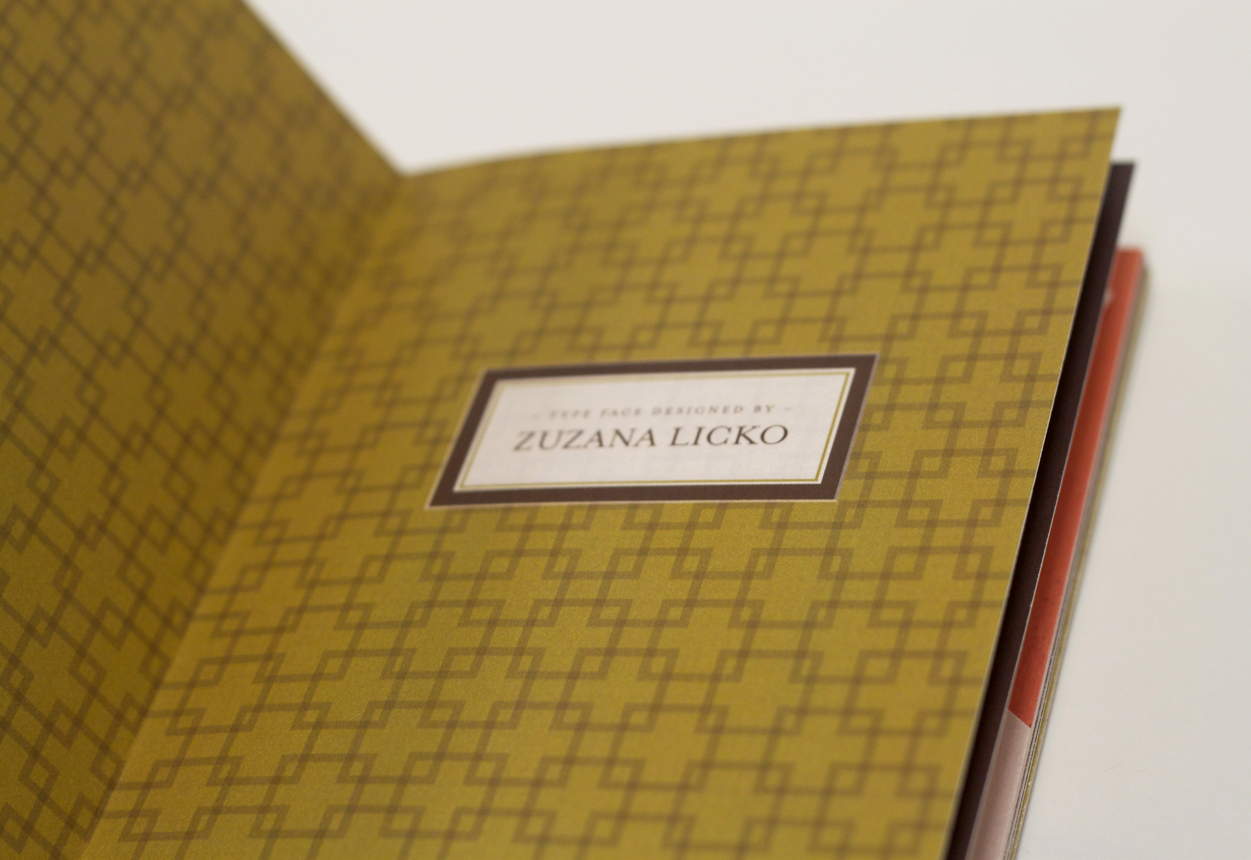
01/ Type SpeciMEN Book
Mrs Eaves by Zuzana Licko is a perfect example of beautiful typography.
For a type specimen book, I wrote and designed a diary that traces the love story between Mrs Eaves and Baskerville. Using solely typographic elements, the diary shows off the unique characteristics of the typeface and explains why it has remained so relevant in the design world. The images below are of one out of the three books that were printed and hand bound.
02/ AMNESTY INTERNATIONAL CONCEPTUAL WORK
Girls need you to support their rights.
This conceptual poster series was done for Amnesty International to bring awareness to the Violence Against Women Act (VAWA). Utilizing the bold brand colors of Amnesty International, these posters seek to depict the the struggle of being shut out and silenced. The desaturated images of women with their sight and voice obstructed by black bars and text aim to elicit a desire to help these women by calling the viewer to come to their aid.
We all benefit from taking notes from the past.
This specific style and feel is very much reflective of the work of Barbara Kruger, an American conceptual artists. Barbara tends to use type bound in boxes, at times obstructing the sense, and primarily uses black and white photography with red typography.
03/ NEW ALPHABET
Pencil-shavings, glue, and a bit of PhotoShop clean-up.
Time to take out the pencils and paper. Our challenge was to create an alphabet in any unique way. I was inspired by colored pencil shavings curvy shapes to construct these letters. The process included sharpening a multitude of colored pencils, collecting the shavings, applying rubber cement to a board, and crafting them into their letterforms. After they were set, I photographed them individually and digitally cleaned each form to yield the final clean result. The letters were composed individually, to be used in a poster form, but also for name tags and other design elements!
04/ TYPOGRAPHIC BLOCKS
Futura type blocks with six harmonious and unique sided designs.
Though the blocks seem somewhat elementary, this design was a test to design six unique compositions that worked together. Today, it reminds me of the same thought process that one would use when curating an Instagram feed or developing a cohesive web platform.


